Coyote Acres Homestead
Client
Chet & Morrisa
Date
03 - 15 - 24
Category
Rebrand
Heritage. Family. Authentic. Rustic. After our initial discovery phone call we knew we wanted to be the agency working on this project. From the city to the country, Morrisa embraces that can do attitude! She has accrued quite the social media following by being her authentic self. You can find all of the behind the scenes achievements, failures, and purely entertaining content on her personal page.
Her personal brand was very well cared for. However, there was one major problem, they didn’t have a brand identity that expressed the core values and personality of Coyote Acres.
They knew that they wanted their brand identity to embody the grit and hardwork that goes into their homestead, all the while being inviting and playful. Providing the most beautiful flowers, pumpkins and the country experience naturally attracted a wide target audience of mothers young and old.



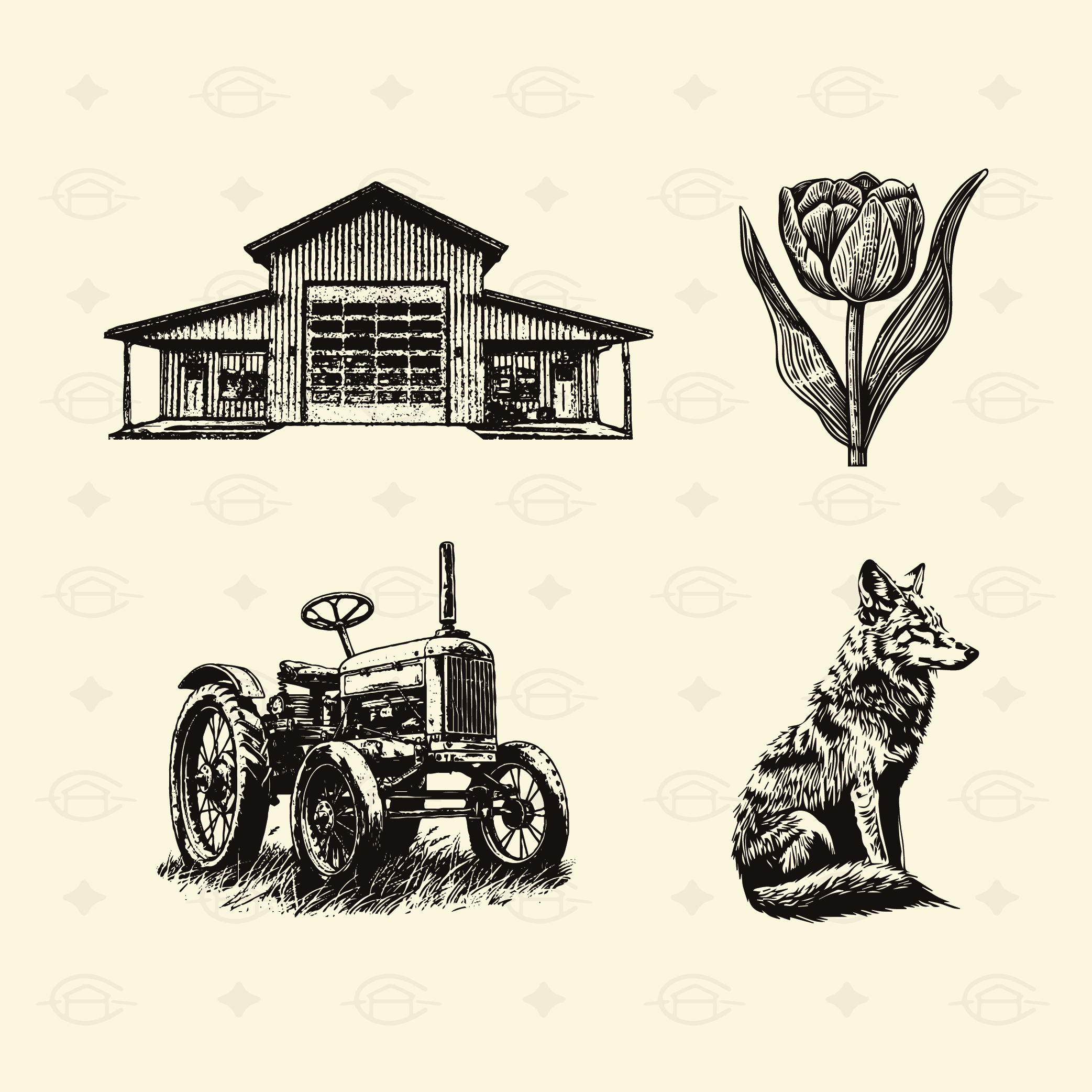



Morrisa made it a point to let us know that she wanted us to do what we do best. She had loved some of our previous work, but she wanted her husband Chet to want to wear the logo mark proudly on merch. So here is the brand identity in all of its glory. It speaks to their heritage, location, and who they are as a family. Through hand drawn vibes within the fonts, icons, and assets people are able to feel invited onto Coyote Acres Homestead and into the Reynolds family each time they visit. Our designs not only embrace their core values, but urge couples to ask they question, “Why don’t we start a homestead?” Did we mention Chet likes wearing it too?!

